How to Edit a Theme

Overview
AI Course Creator offers a wide variety of themes, you can utilise these pre-loaded themes to enhance your course's appearance or modify them to best suit your preference. In this tutorial, we will discuss how to edit a theme.

Step Tutorial
1. Click the 'View Course Theme' button to see all the available themes.
2. You should be able to see all the available themes.
 NOTE: You can use the category filter to easily sort themes related to the selected category. Select the desired category from the drop-down menu and click the 'Search' button.NOTE: If you are familiar with all the available themes and prefer not to scroll through the page, you can also use the search box to find the theme you are looking for. Simply type the theme name (e.g. Spring, Fun, and eSkilled) and click the 'Search' button.
3. To begin editing a theme, simply click the 'pencil' icon below the theme name. For this tutorial, we will be using the eSkilled theme. Clicking this will redirect you to the theme editor page.
Theme Editor Page
The theme editor page is split up into different sections:
Theme Information
Theme information is what is visible on the themes page list or theme selector. Fill in the necessary information before proceeding to the next part.
1. Name — Replace the name of the theme that you are currently editing. This can be any word that you prefer (e.g. Sunshine, Monday, and Adventure).
2. Active — Turn on this toggle to display the theme on the 'Themes List' page. Alternatively, disable the toggle to hide the theme.NOTE: The 'Show Inactive' toggle found on the 'Themes List' page allows you to view themes set as inactive. This is turned off by default.
- 'Show Inactive' toggle off
- 'Show Inactive' toggle on
3. Category — Identify to which category this theme falls under (e.g. Finance and Hospitality).4. Theme Style — Select the style for your theme. Choose from the 6 options (eSkilled, Spring, Summer, Autumn, Winter, and Playful).5. Theme Image — Update the theme's image by clicking the 'Add Image' button.
- You may refer to the tutorial on How to Use the Tool Blocks > B. Image > Image Addition to learn more about uploading an image.
- You have the option to use the same image for the cover page and theme image. Enable the 'Use Cover Page As Theme Image' toggle to do this.
Cover Page
The cover page set-up consists of four key elements: the cover image, title font style, background, and the start course button. Ensure each part is customised to your preference before moving on to the next section.
A. Cover Image
Update the cover image for your theme by clicking the 'Replace Image' button.B. Title Font Style
This title font style reflects the title of your course. You may change the font family, size, and colour.C. Background
The background is visible on the thumbnail of your course. To change this, click the 'Replace Image' button.D. Start Course Button
Customise the 'Start Course' button by modifying the font family and size, as well as adjusting the text colour, start colour, and end colour.
Completion PageThis section allows you to customise the completion page settings.
1. Completion Image — This field enables users to upload an image that will be displayed on the completion result screen. Default completion images for each theme are already uploaded.2. Completion Title — This field serves as a headline for the completion message (e.g. 'Congratulations' or 'Thank You'). This field accepts HTML input.3. Completion Message — This field enables users to set a default completion message, which can be customised on the course builder page. This field accepts HTML input.4. Transparent Colour — The users will have the ability to set a colour for the transparent section of the completion page where the completion message is displayed. Opacity will be pre-defined, allowing users to customise only the colour.5. Preview — This part shows a live preview of the settings.
- After completing the theme set-up, a new section titled 'Completion Page' will be added in the course builder, located after the outline.
- You can readjust the completion page set-up by clicking the 'cog' icon in the upper right corner of the completion page within the course builder.
- You have the option to reset the completion image to its default settings.
- The completion banner will automatically match the topic banner uploaded in the selected theme. You will not be able to customise or modify the completion banner separately.
- When you update a course's theme, the completion page will be updated accordingly to reflect the new theme.
- A 'Finish' button will be implemented on the last screen of the course preview. Upon clicking this button, the user will be redirected to the completion page.
- If the course navigation type is 'Free', the 'Finish' button will be displayed on the last screen of the course preview regardless of the completion percentage and quiz navigation type.
- If the course navigation type is 'Linear':
- The 'Finish' button should only be displayed if the user has scrolled through the end of the last subtopic.
- If the last subtopic includes a quiz, the 'Finish' button will be displayed only if the user has completed the quiz.
- If a course does not have a completion image or completion message configured in the 'Completion Page' section of course builder, the completion page will not appear in course preview.
Course Content Banner
This section includes the ability to customise content banner styles for different content types.
A. Background
- Background Options — Select 'Background Image' or 'Colour Only' option for the banner.
- Banner Image — Upload a banner image.
- Banner Size — Choose if the banner must be stretched fully across the page or be confined to a fixed width, centred within the content area.
- Banner Corners — Choose between round corners or square corners for content banners.
- Banner Icon When Added Manually (Optional) — Add an icon at the beginning of the content header.
- Preview — This part shows a live preview of the settings.
B. Banner Font Styling
This allows customisation of text with options for font style (bold, italic and underline), size, colour, emphasis, and text alignment (left, centre and right).C. Default Banner Texts & Icons
These will be used when adding the related content type.
1. Enable Default Content Banners — When toggled on, the system will display all default content banner elements. When toggled off, all default elements will be hidden, and banners will not be automatically created when adding content types during course creation (e.g. practical examples, case studies, scenarios, videos, quizzes and further reading).2. Banner Text — Add text on top of the banner.
- You can also reset the banner image and banner icon to their default settings after making changes or uploading new ones by clicking the 'reset' icon.
- You may refer to the Tutorial on How to Use the Tool Blocks > Image Types and Formats > Content Banners to learn how to customise the content banners for specific content types.
Course Builder
This section includes the ability to customise styles for your course's tables and fonts.
A. Font Settings
All the font-related modifications for your course can be found here. These fonts are used inside your course. You can add the hex colour that you prefer.
B. Image Settings
The default image settings for your course can be set up here. These settings allow you to customise the appearance of images within your course content.i. Image Corners — Allows you to choose between 'Square' or 'Round' corners for all the images added in your courseii. Overlay Background Colour — Allows you to select a background colour for all 'Text on Image' content in your course, including the 'Text on Image' option used in Flip Cardsiii. Opacity (0) — Allows you to set the 'Opacity' level of 'Overlay Background Colour' for all 'Text on Image' content in your course, including the 'Text on Image' option used in Flip CardsNOTE: The default selection is 'Transparent' (0).
C. Table Settings
All the table-related settings for your course can be found here. These settings allow you to customise the appearance of tables within your course content.
i. Table Header Colour — Allows you to select the colour settings for the table headerii. Table Header Font — Allows you to customise the 'Font', 'Size', 'Colour', 'Text Alignment', and 'Emphasis' for the table header
- Table Row
i. Table Row Colour — Allows you to select the color settings for the table rowsii. Table Row Font — Allows you to customise the 'Font', 'Size', 'Colour', 'Text Alignment', and 'Emphasis' for the table rows
- Table Border — Enables you to customise the 'Border Style', 'Border Width', and 'Border Colour'
- Table Alignment — Allows you to set the default alignment for all the tables that will be added in the course builder
- Preview — Shows a live preview of the settings
- The table settings established in 'Themes' will be applied to any table content added in 'Course Builder' where that theme is used.
- When you update the theme on your course, appropriate settings for table content will also be applied.
D. Interactive Activities
This section includes the ability to customise styles for interactive activities.
- Hotspot
A hotspot interactive activity allows learners to click on parts of an image to explore additional information. 'Hotspot Settings' contain the following features:
- Overlay Style for Hotspot Icon — You can set a default overlay for hotspots with the following options:
- Letters
- Numbers
- No Overlay
- Letters / Numbers — Displays the overlay colour and hides the hotspot icon
- No Overlay — Displays the hotspot icon and hides the overlay colour
- Hotspot Content Font Style — You can set a default styling of the fonts for all the hotspot contents.
- Preview — You can see a live preview of the settings.
- Flip Card
A flip card interactive activity involves cards that can be flipped to reveal additional information. 'Flip Card Settings' contain the following features:
- Front of Card Settings — Default images can be set for flip cards, varying based on the 'Single Column', 'Two Columns', and 'Three Columns' layouts. These images will be used for the 'Image' and 'Text on Image' side of the flip card. You can customise these images for a specific theme or reset them to the default images if needed.
- Back of Card Settings — You can set a default background colour and font settings for the text side of the flip card, but you can still customise them at the course level.
- Preview — You can see a live preview of the settings for the 'Single Column', 'Two Columns', and 'Three Columns' layouts.
- Step Slide
A step slide interactive activity breaks down a process or list into separate, easy-to-absorb slides. ‘Step Slide Settings’ contain the following features:
- Font — You can alter the appearance of the step slide title by selecting a default font family.
- Size — You can input a specific font size for the title.
- Colour — You can apply a font colour to the title by choosing from the colour palette, typing a hex code, or using the colour picker.
- Emphasis — You can enable any or a combination of these toggles to accentuate the title:
- Bold
- Italic
- Underline
- Preview — You can see a live preview of the settings.
NOTE: The title font style will follow the ‘Heading 3’ settings defined for the theme, while the preview will provide a real‑time display of the step slide settings.
E. Content Padding Settings
This part allows you to specify the padding size before and after the content within a block. These settings will be applied to text contents in the course builder.
F. CTA Button SettingsThis section lets you customise the appearance of call to action (CTA) buttons for links.
- Button Size
- Button Width — Defaulted to 75 px
- Button Height — Defaulted to 20 px
NOTE: Width and height will automatically adjust based on the CTA button's text.
- Button Font Styling
- Font — Defaulted to 'Paragraph' font settings
- Size — Defaulted to 'Paragraph' font settings
- Colour — Defaulted to 'Paragraph' font settings
- Emphasis — Defaulted to 'Paragraph' font settings
- Button Colour — Defaulted to 'Next' and 'Previous' button colour settings
- Button Colour On Hover — Defaulted to 'Next' and 'Previous' button colour on hover settings
- Button Alignment — Defaulted to centre
- Preview — Gives a glimps of how the button would look like
4. Once complete, click the 'Save' button to save the changes you have made across all sections.
NOTE: Changes made to each theme are permanent and will be applied for all users. Ensure to finalise changes before saving.Course Preview
The course page set-up allows customisation of several key elements: Navigation Menu Settings, Course Heading Settings, Progress Status Font Style, Progress Status Font Style, and Topic Heading Settings. Adjust each section to suit your needs before proceeding to the next step.
A. Navigation Menu
All the navigation-related changes belong here. Fill in your desired hex colour for each field.B. Course Heading
This is the background image and font colour for the course title. Replace the background by clicking the (i) 'Replace Image' button, then add the (ii) 'Course Title Font Colour'.
All the progress-related settings can also be configured in this section. These include (iii) 'Progress Status Font Style', (iv) 'Progress Bar Colour', and (v) 'Progress Indicator Colour'. Replace them with your preferred colours. You can also see a live (vi) 'Preview' of these settings.C. Topic Heading
This section contains the topic heading. Both the background image and font colour can be configured here.
Favourites
You can set up or mark a certain theme as a favourite by clicking on the 'star' icon.
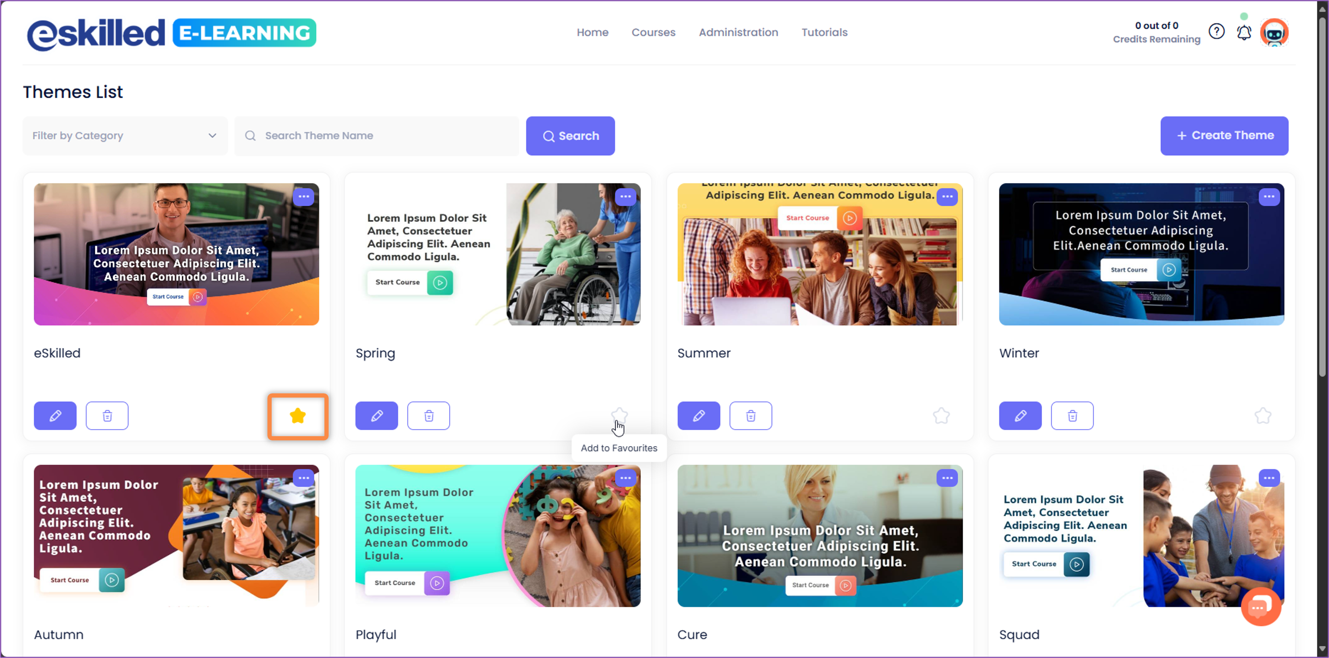
NOTE:- Themes marked as favourites will be displayed first on the 'Themes List' page
- In Course Wizard > Step 3 – Course Settings > Select Course Theme, themes marked as favourites will be displayed first also.
And those are the steps on how you can successfully edit a theme.
Related Articles
How to Create a Theme
Overview AI Course Creator offers a diverse selection of themes designed to enrich the visual presentation of your course. As of now, there are 18 distinct themes available, each meticulously crafted to offer a unique blend of colour schemes, fonts, ...How to Change the Theme of an Existing Course
Overview In this tutorial, we'll discuss how to change the theme of an existing course. Step Tutorial 1. Click on the 'View Course List' button to access all available courses. 2. This page contains all the available courses. Locate the course you ...How to Create and Edit Categories
Overview In this tutorial, you will learn how to create categories to conveniently organise your courses. Step Tutorial Create Categories 1. Hover your mouse over 'Courses' and then select 'Categories'. 2. This page contains a list of all available ...How to Edit a Course Cover Page
Overview The course cover image plays a crucial role as the first page that learners see. You have the flexibility to personalise it based on your preferences to elevate the overall quality of your course. Step Tutorial 1. Click the 'View Course ...How to Edit the Course Blocks
Overview Whether you've used AI to generate your course content or created it manually, you have the flexibility to add, rearrange, edit, duplicate or delete the course blocks to suit your needs. This customisation allows you to refine the structure ...